Style UX Guidelines
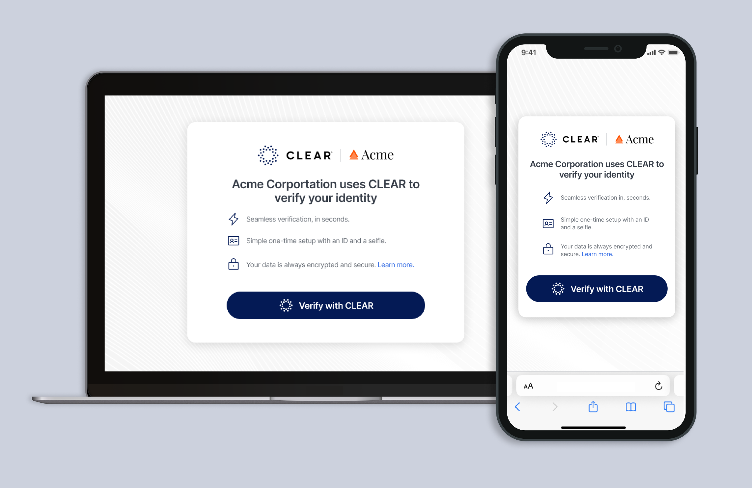
Customer Handoff Page
Providing upfront context via a screen or interstitial before redirecting the user to CLEAR is essential, as it helps set the user's expectations about what will be needed for verification, and address any concerns about privacy and security before they enter the verification experience.
Key Elements:
- Contextual reinforcement of the association between your organization and CLEAR for identity verification; or any specific use case that CLEAR is helping to enable
- Simple bullets reinforcing what is requirements for verification, such as Government ID and a selfie. Include expectations on quick timing, and nods to privacy and security with a link to CLEAR's privacy commitment
- Branded CLEAR button
CLEAR Button Guidelines
The branded CLEAR button should be used within your experience for users to launch the CLEAR UI.
- Always use with our approved halo logo and a text label within the button
- The preferred text label is “Verify with CLEAR” or “Continue with CLEAR” depending on the context. Please confirm the correct language for your use case with the CLEAR team.
- Use the Inter typeface with modified line heights and letter spacing per specifications below
If the CLEAR button is displayed alongside other buttons in your experience, the following can be adjusted for consistency:
Width, height, corner radius, and distance between the halo logo and text label
Button Builder
Use the button builder below to customize and copy HTML and CSS code for the CLEAR branded button.
Button Specifications
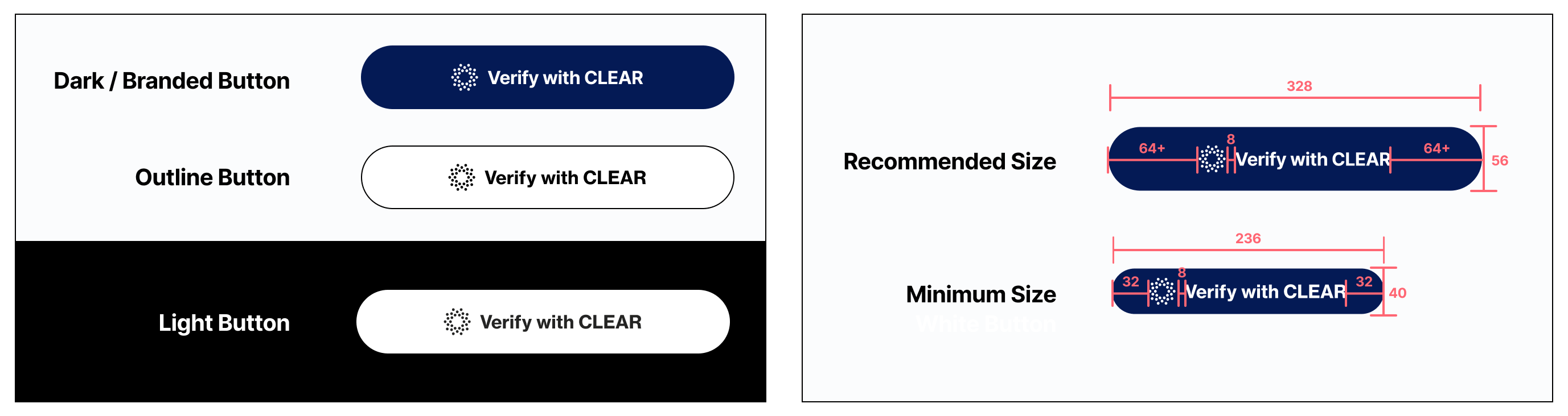
| Dark / Branded Button colors | Button Color: #041A55 (CLEAR Midnight Blue) Logo Color: #FFFFFF Text Color: #FFFFFF |
| Outline Button colors | Button Color: #FFFFFF Border Color: #000000 Border Size: 1px Logo Color: #000000 Text Color: #000000 |
| Light Button colors | Button Color: #FFFFFF Logo Color: #000000 Text Color: #000000 |
| CLEAR Halo Logo size | 24px X 24px |
| Text label typeface | Font: Inter Weight: Semibold 600 Size: 16 Line Height: 26 Line Spacing: -2% |
| Button width x height | Recommended: 328px X 56 px Minimum: 236px X 40 px |
| Button corner radius | 32px |
Pro Tip: To access all color ways and file types (SVG, JPEG, etc), hover over the logo folder and click 'View' on the logo file. All color options will appear in the right sidebar.
Project Branding Specifications
- Color: Full-color or solid black logo only (no white logos)
- Height: 32 px
- Maximum width: 180 px
- File format: PNG with a transparent background
- Export size: 2x resolution (64 px high × up to 360 px wide)
Updated about 1 month ago